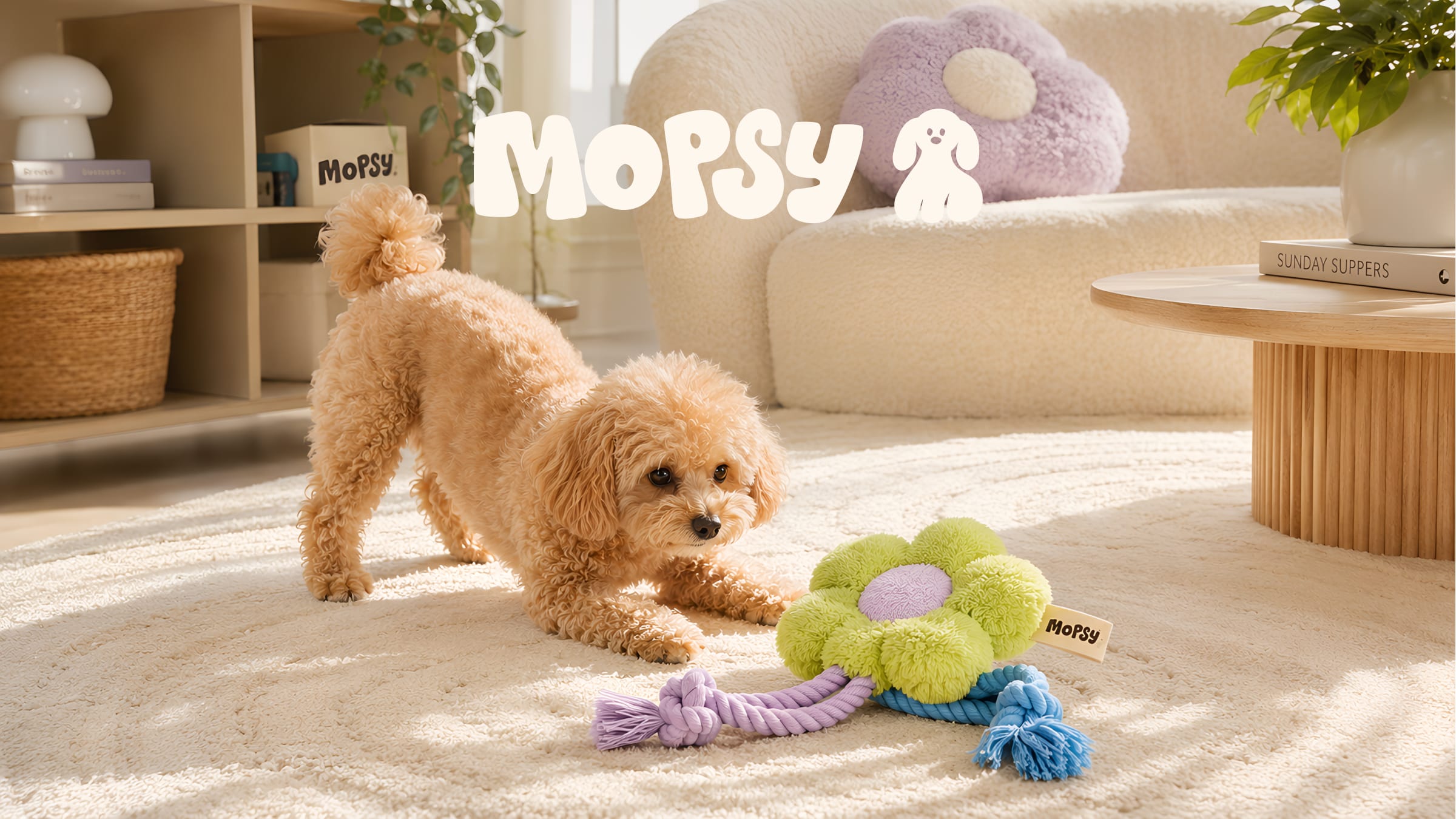
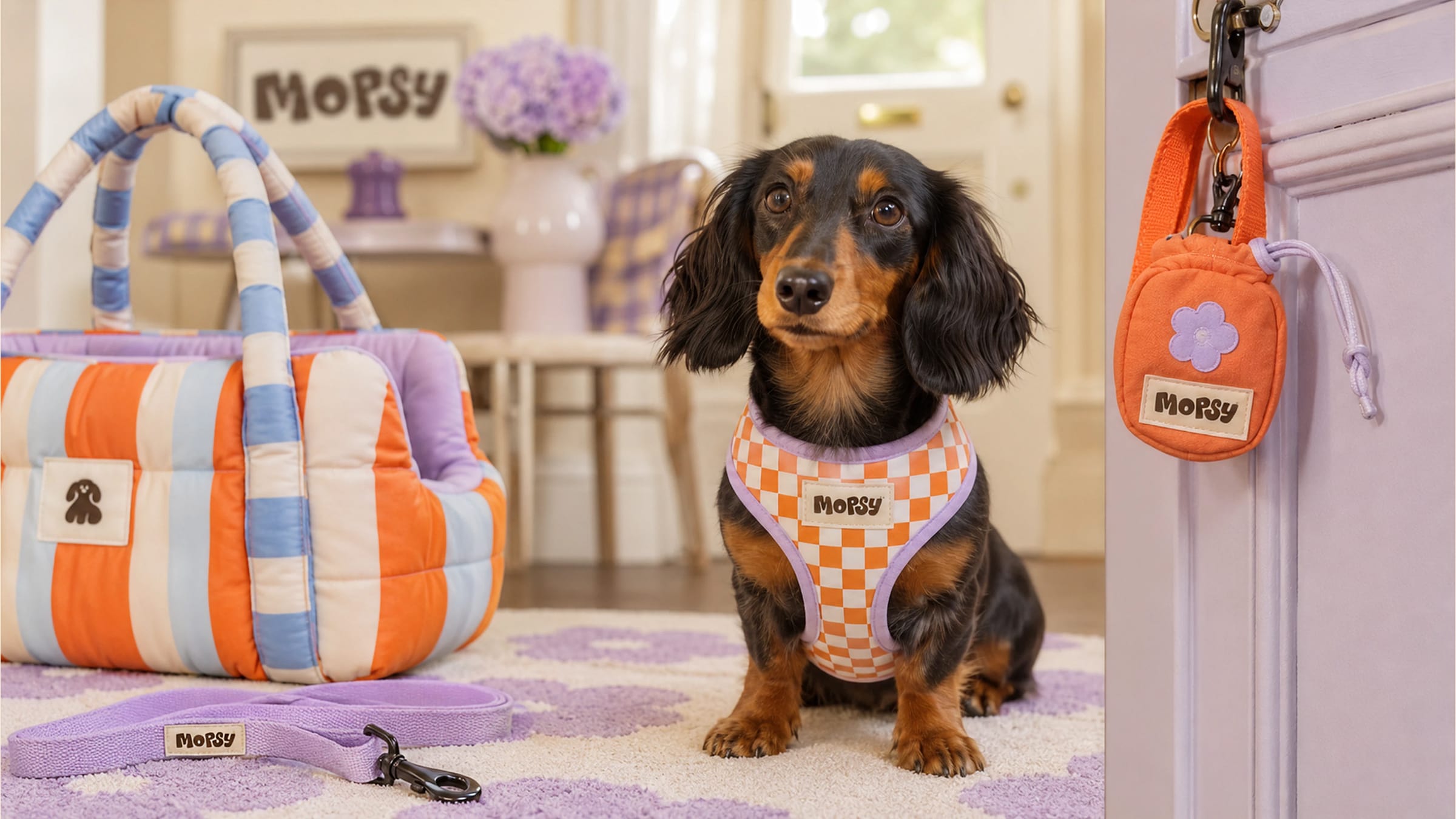
Mopsy
Pet gear that earns its place in the room.
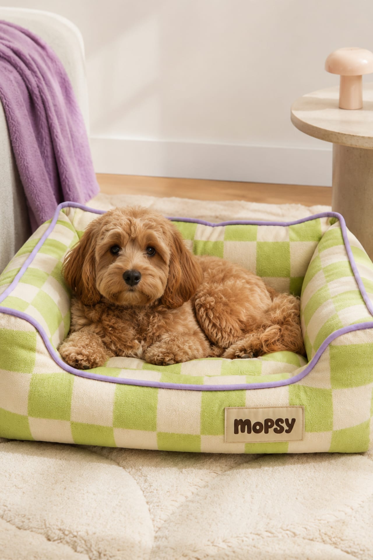
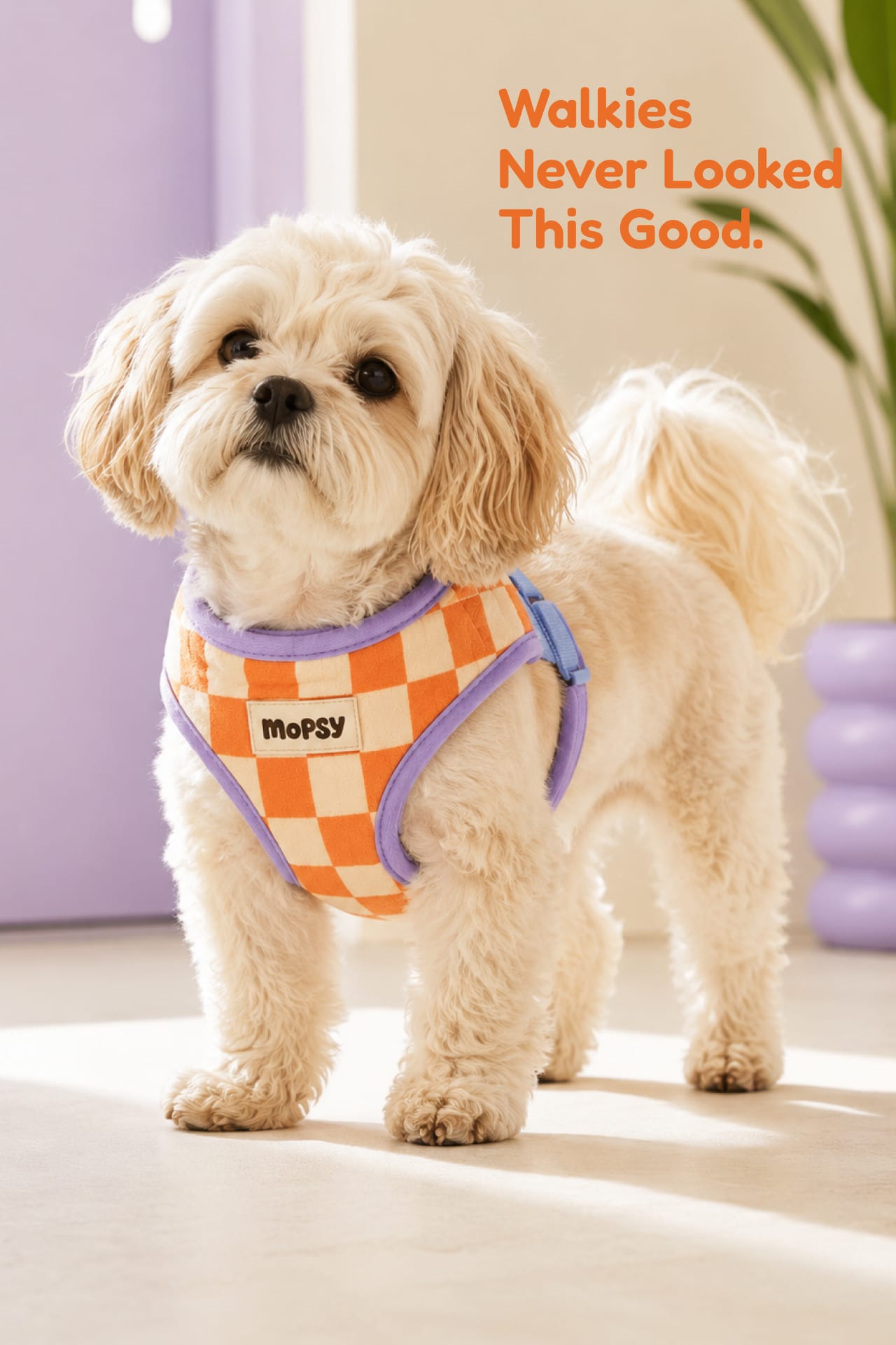
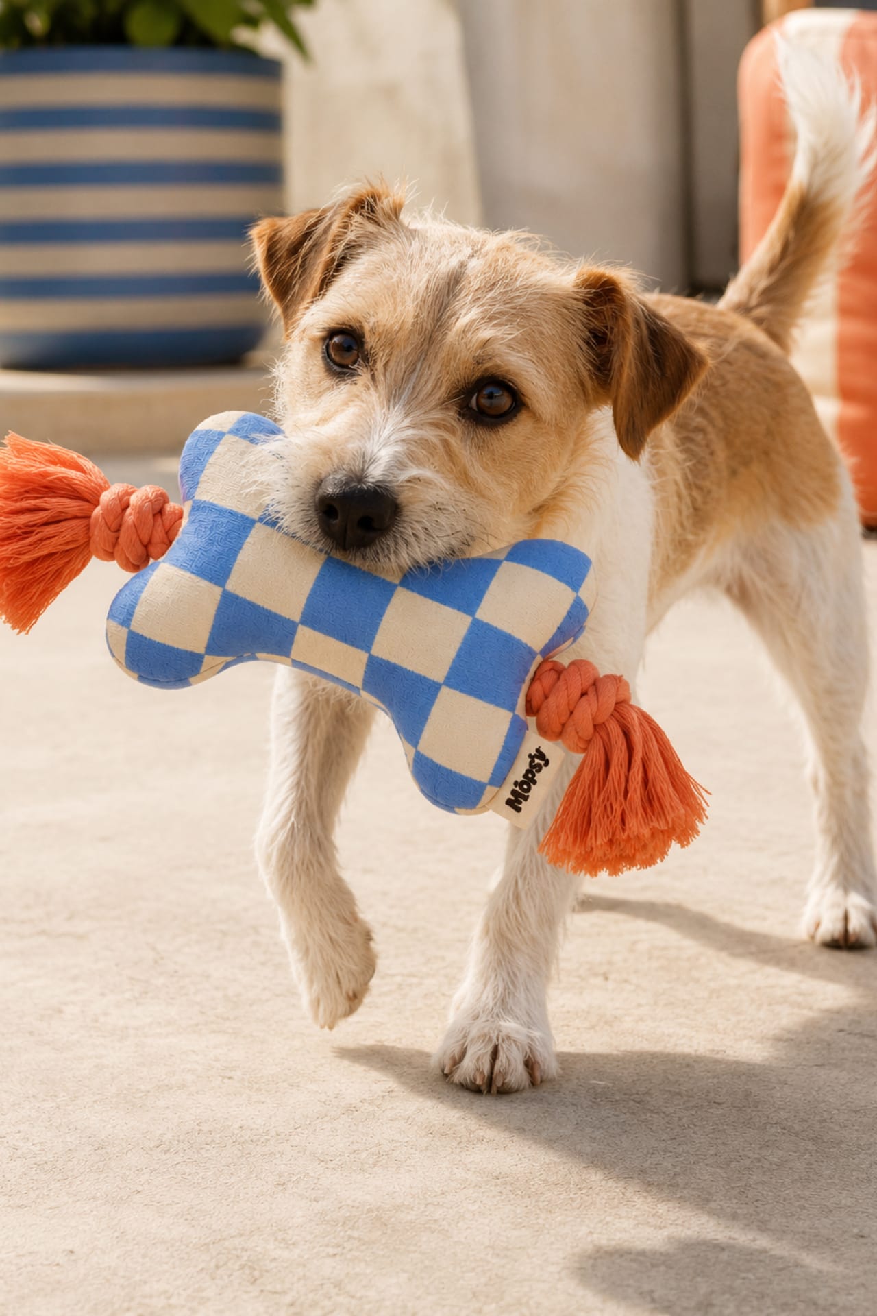
The pet aisle asks owners to choose between something that works and something they'd want to look at. Mopsy refuses the trade — built for a generation that furnishes for their dogs the way they furnish for themselves.
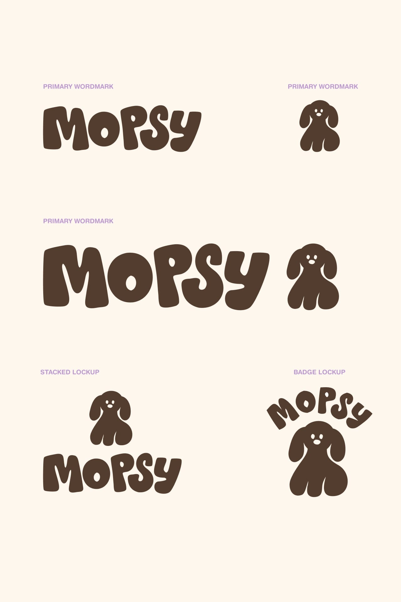
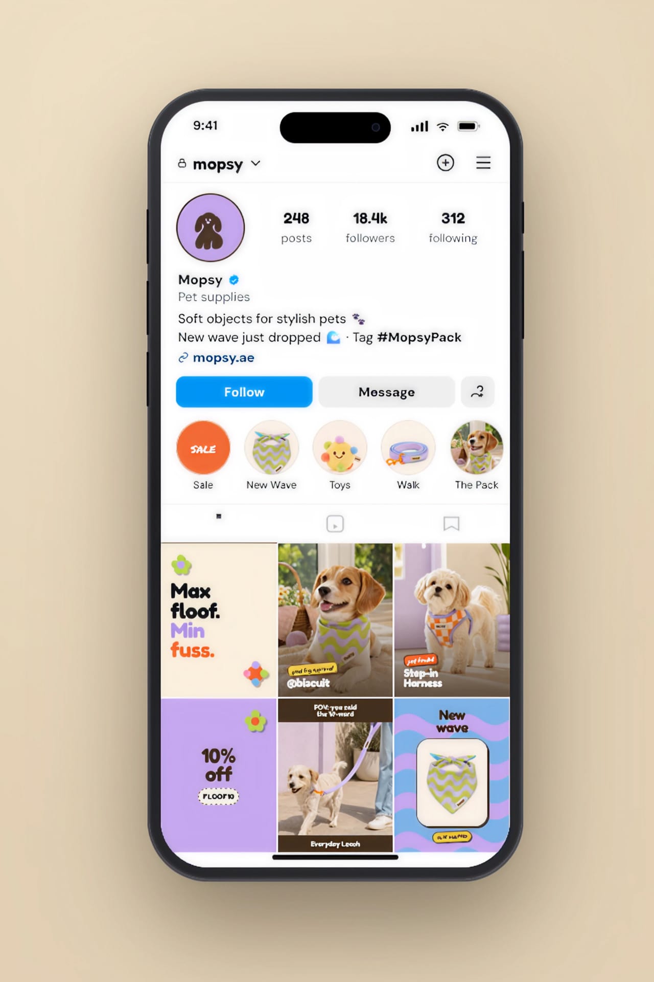
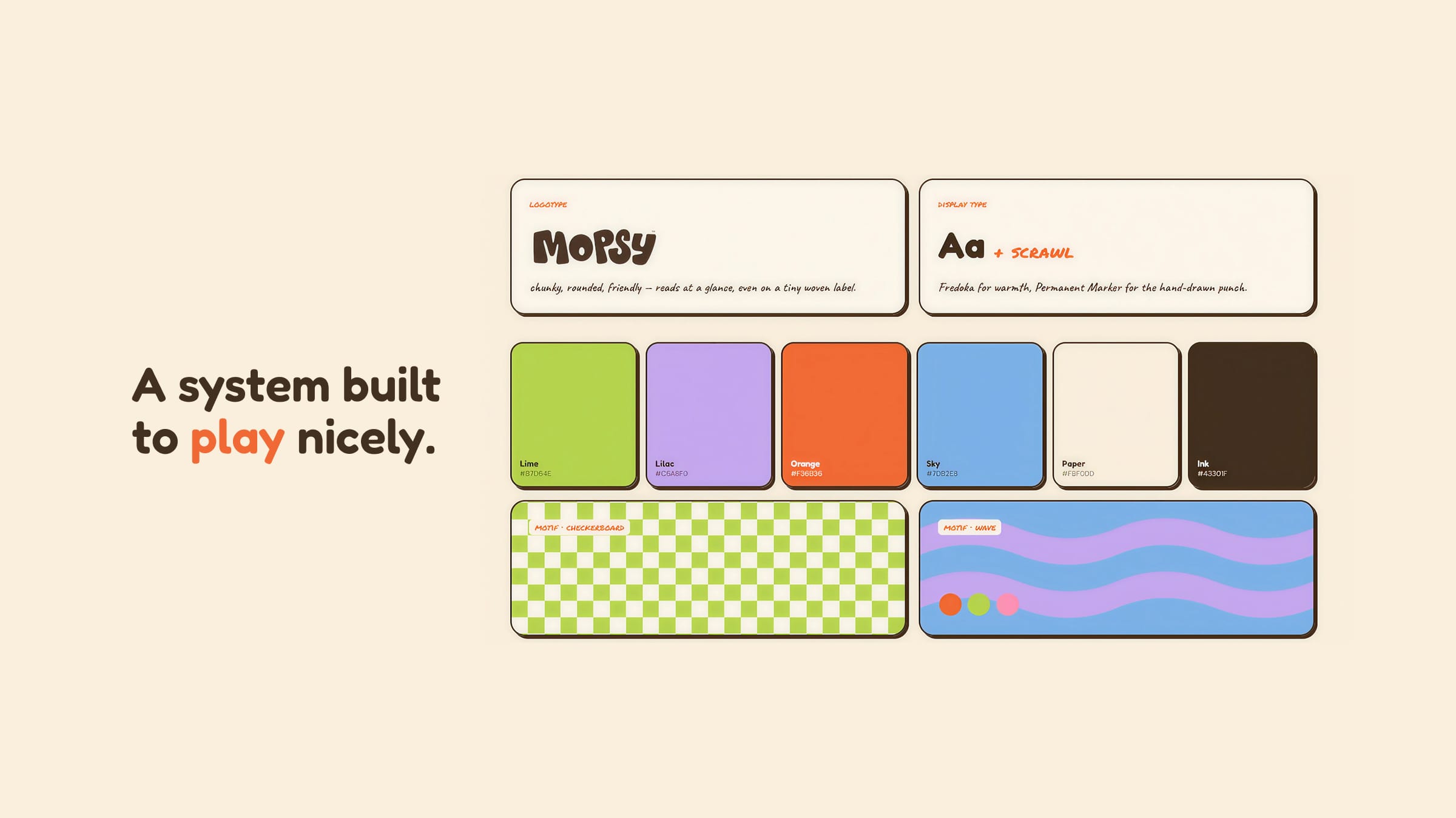
I built the brand from the name out: a chunky rounded wordmark, a floppy-eared pup, and a loud-but-controlled palette that reads closer to homeware than pet store — carried across packaging, a mobile storefront, and the #MopsyPack.
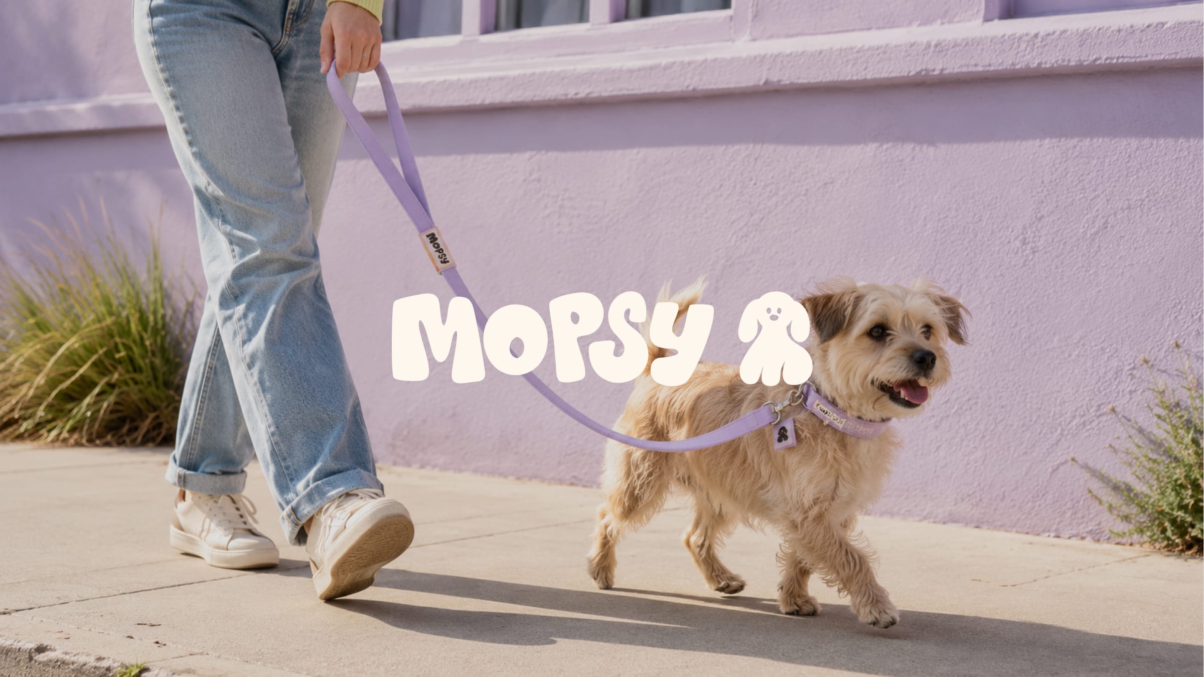
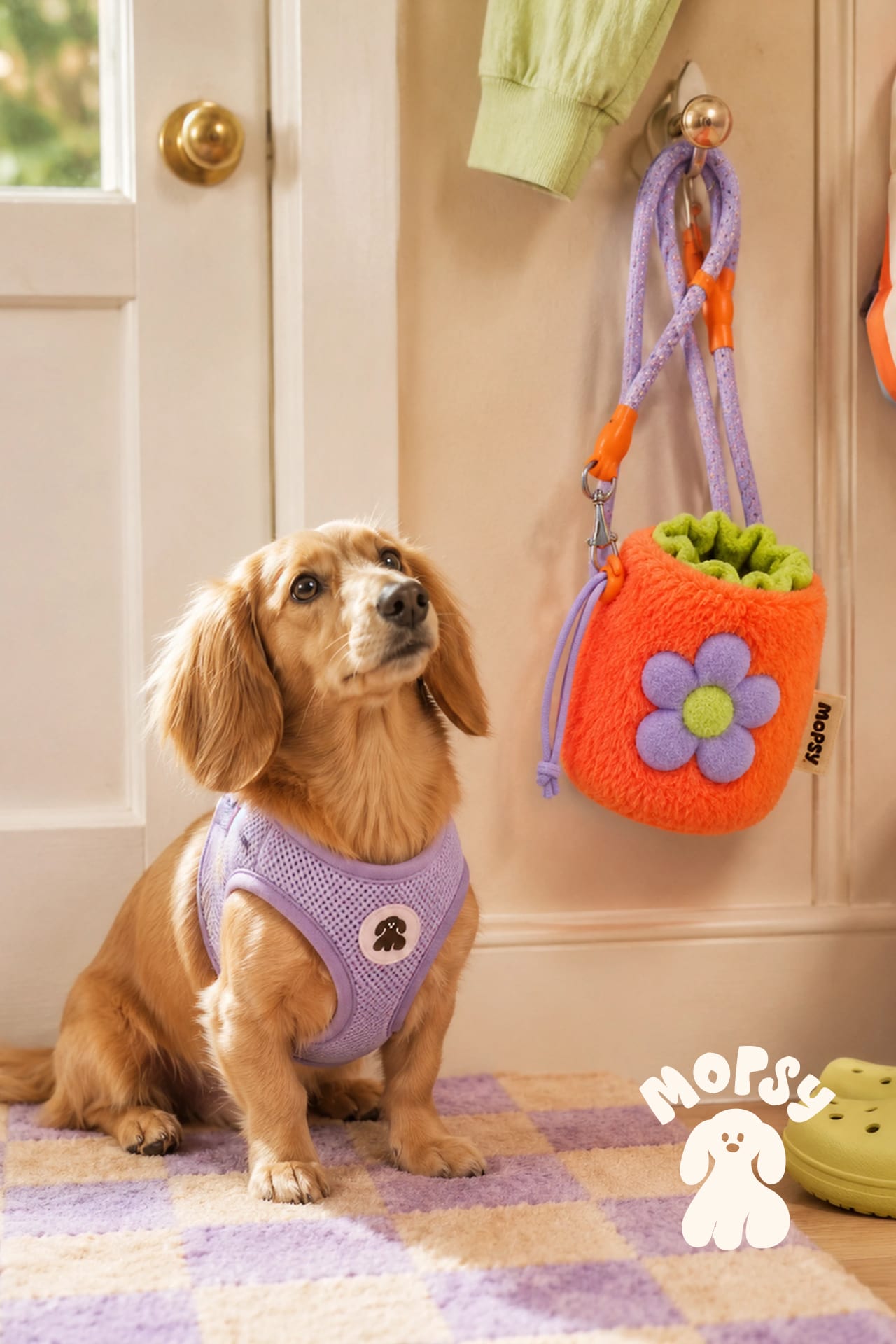
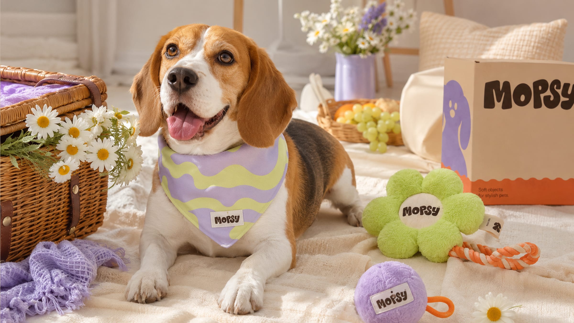
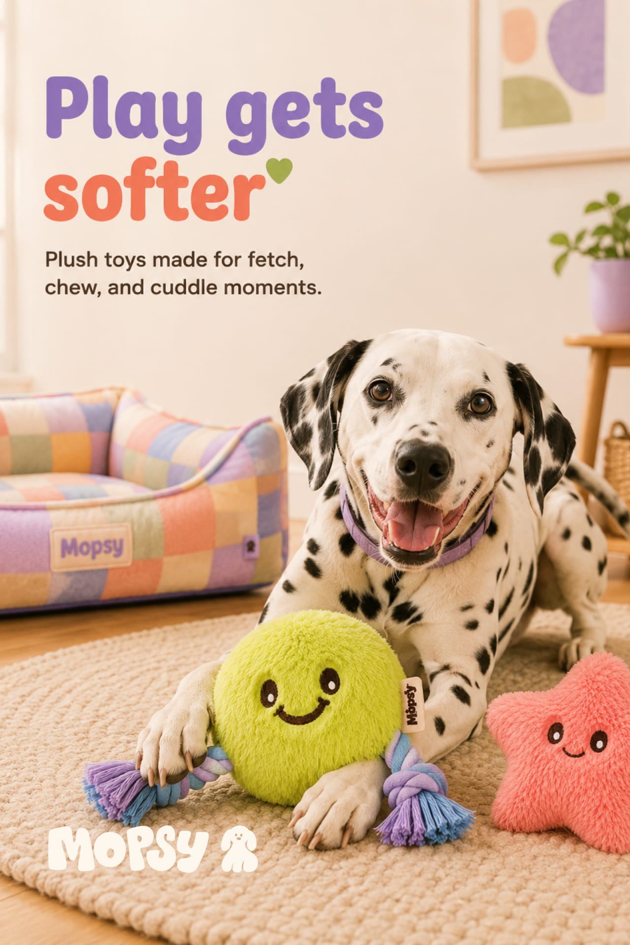
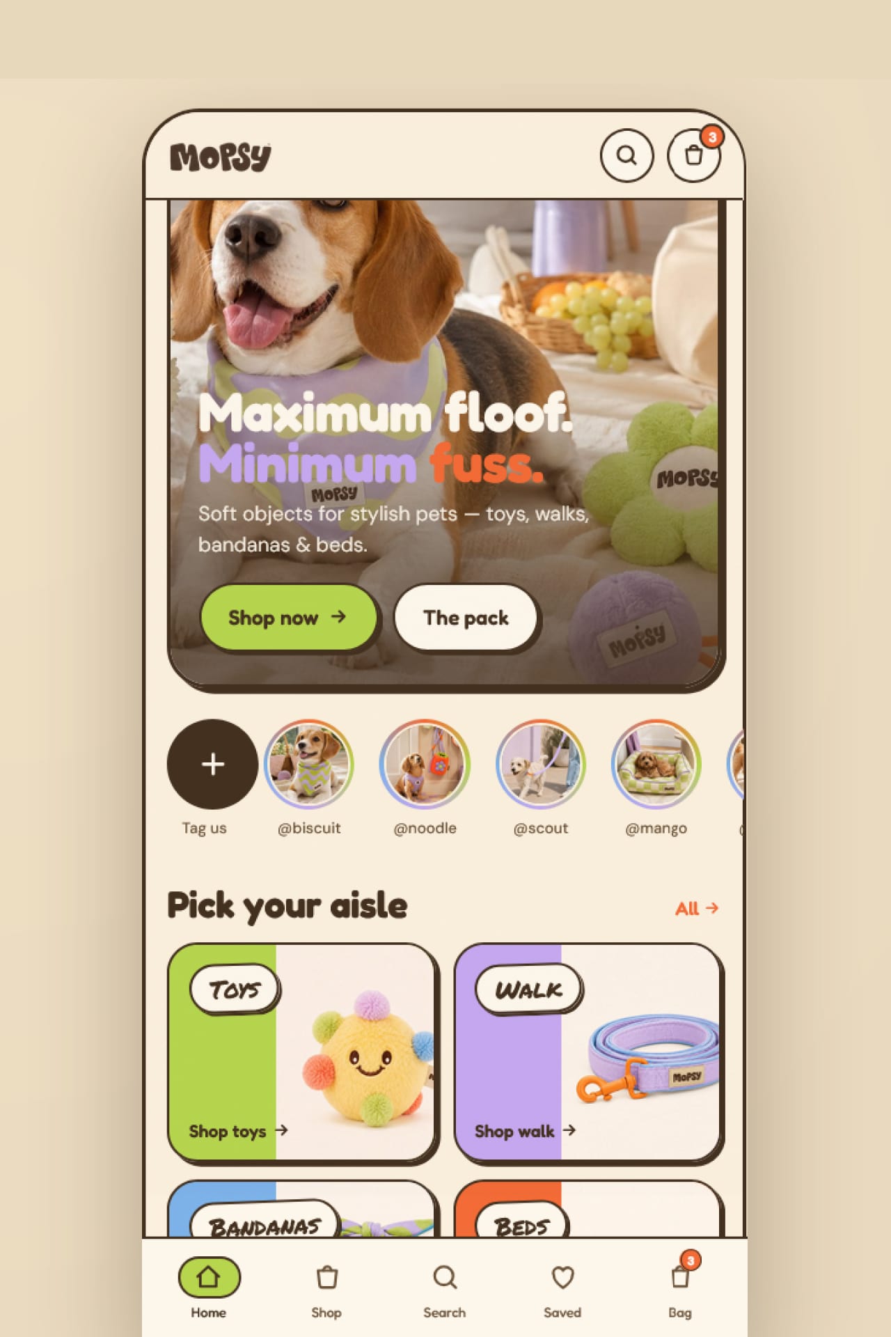
Two motifs carry the system — a checkerboard for the playful surfaces like harnesses and beds, a wave for the calmer ones like bandanas and packaging — so every product finds its place without the whole range locking into one look. Permanent Marker handles the scrawl, the hand-drawn punch on lines like "Max floof. Min fuss." The art direction runs warm and sunlit at home, brighter in the studio for the campaign lines, where the colour does the talking.
Next project
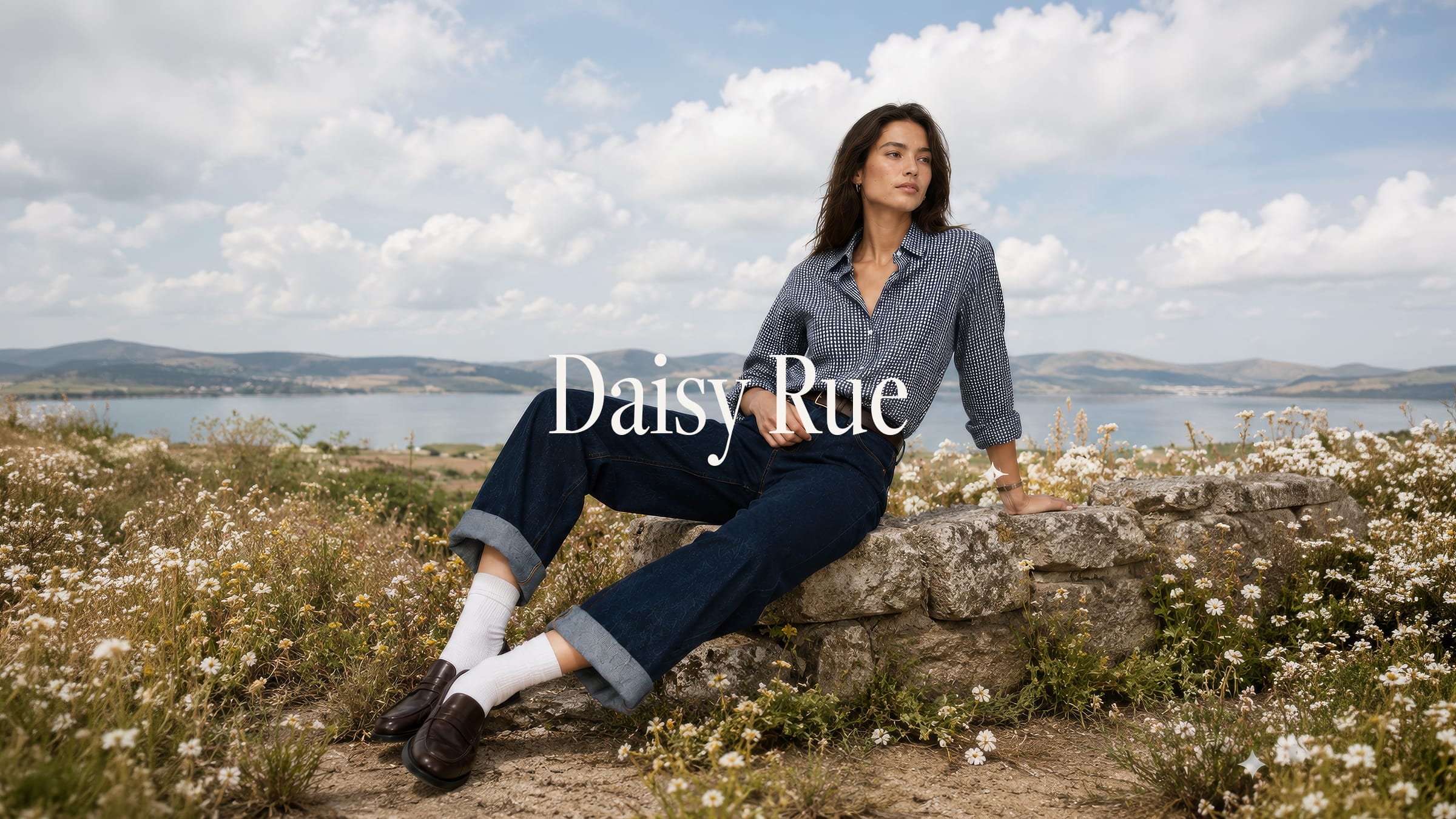
Daisy Rue