GoodTub
Healthy food you'd actually reach for.
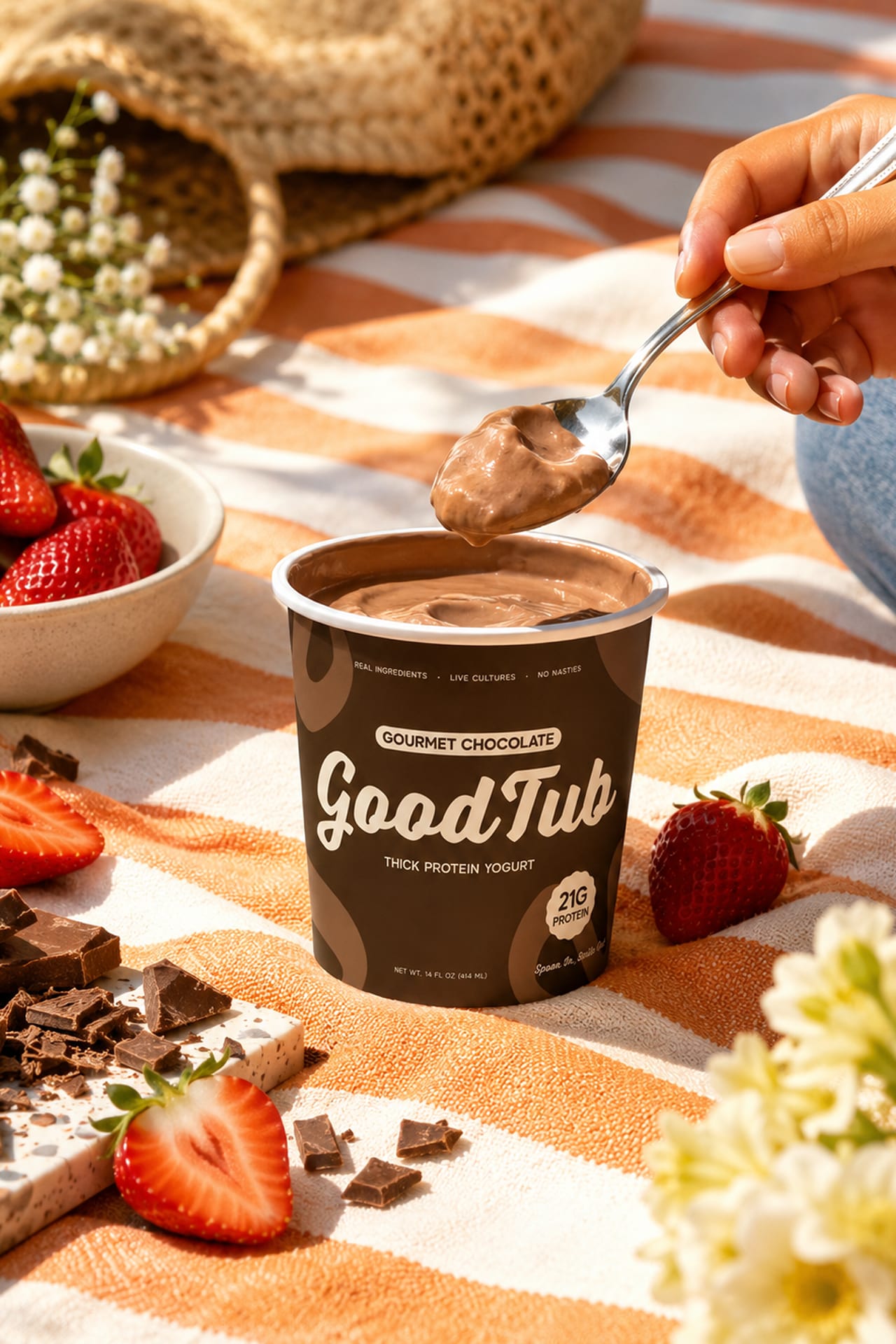
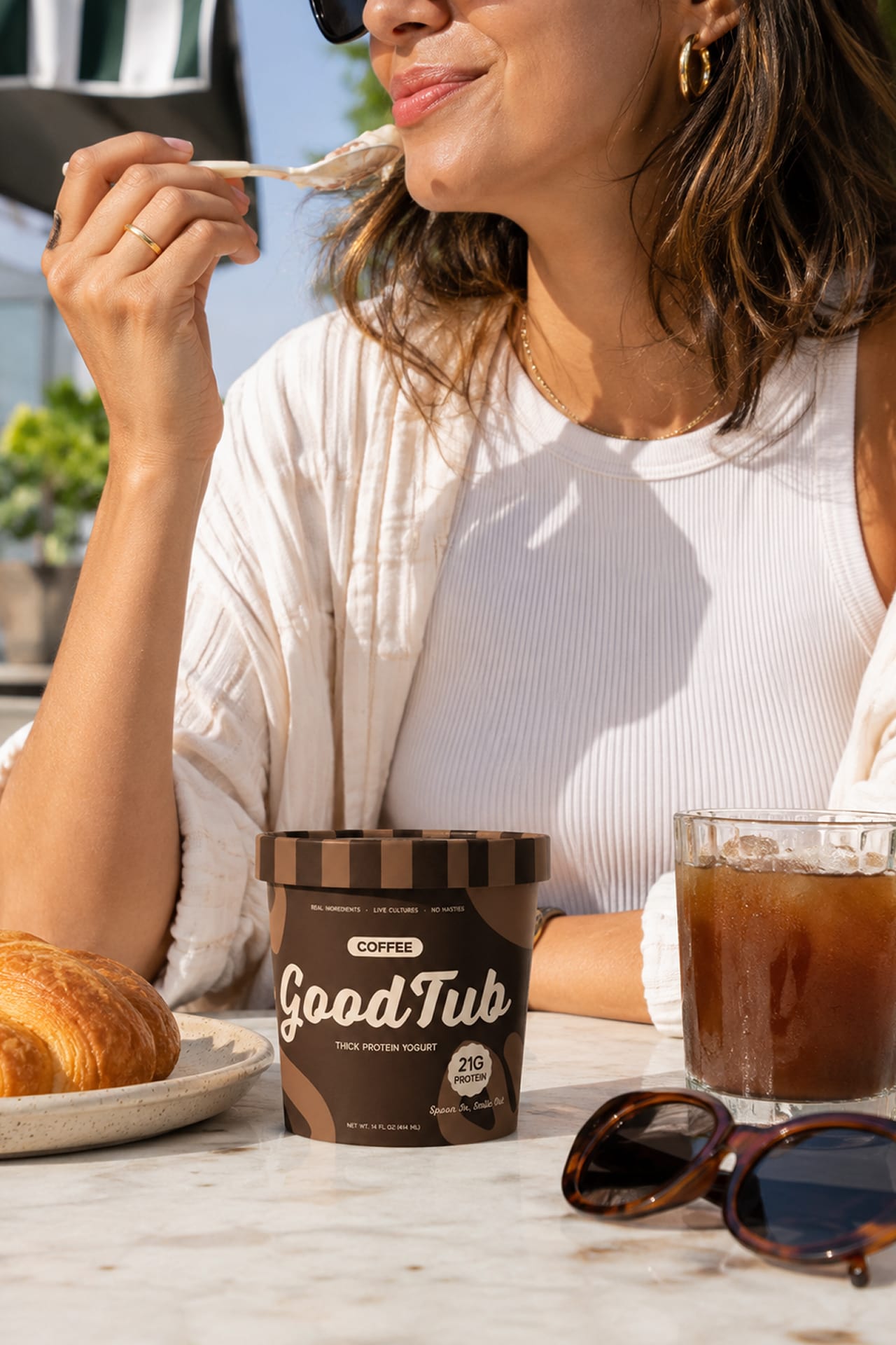
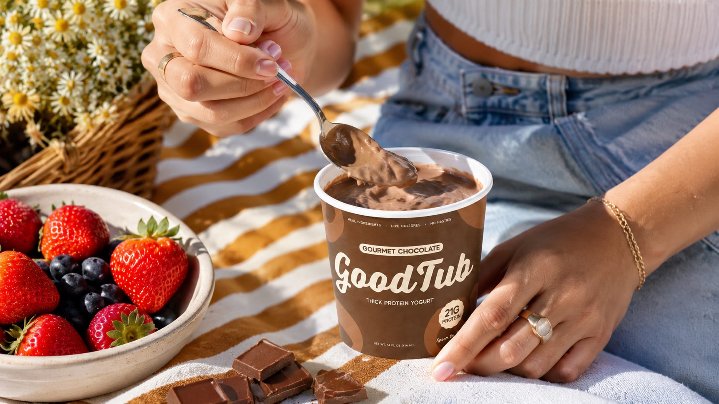
The protein category is all clinical packaging and clean-label austerity — engineered to look disciplined rather than delicious. GoodTub flips it: a high-protein yogurt that leads with appetite, as at home in a gym bag as on a picnic blanket.
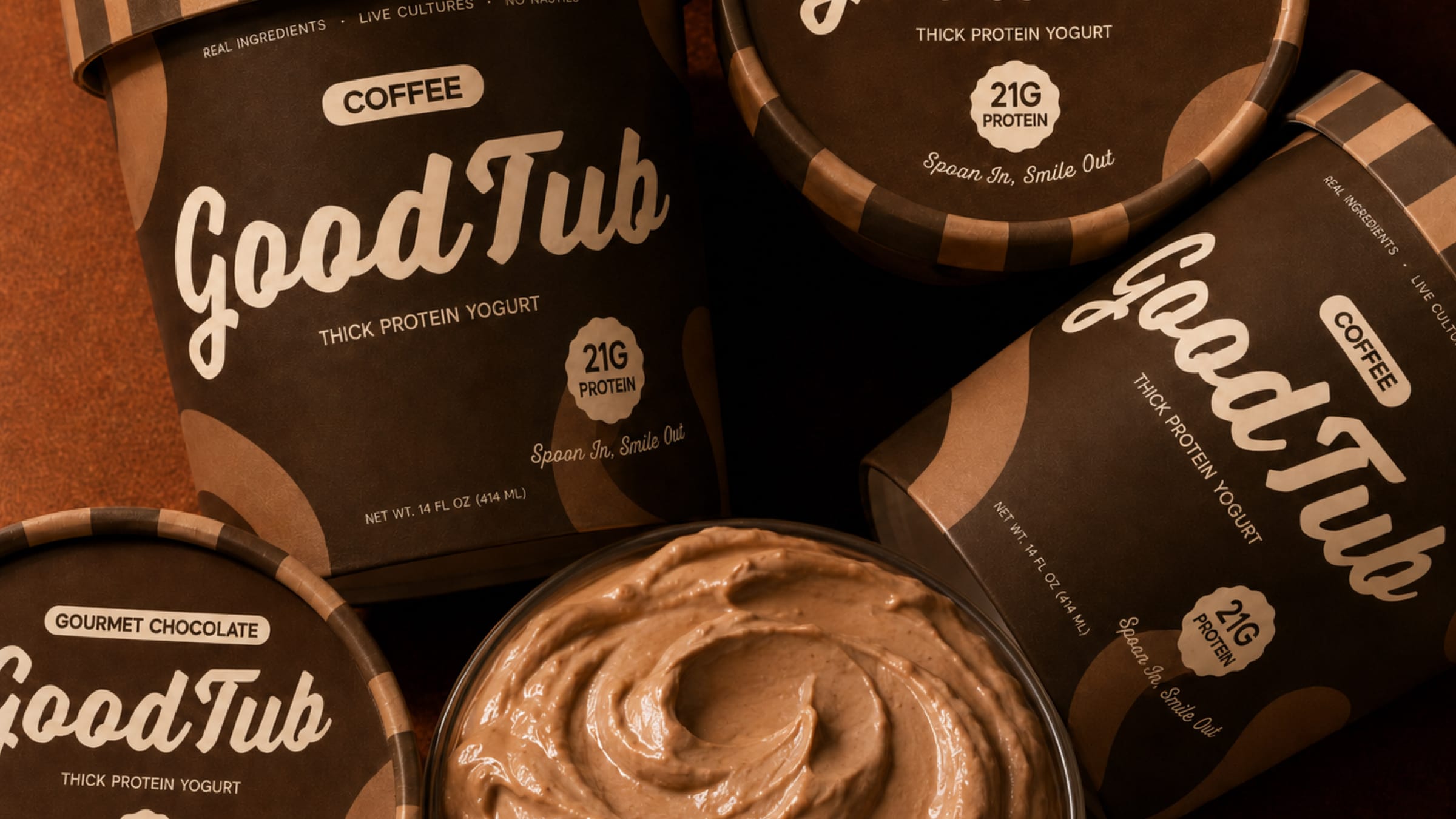
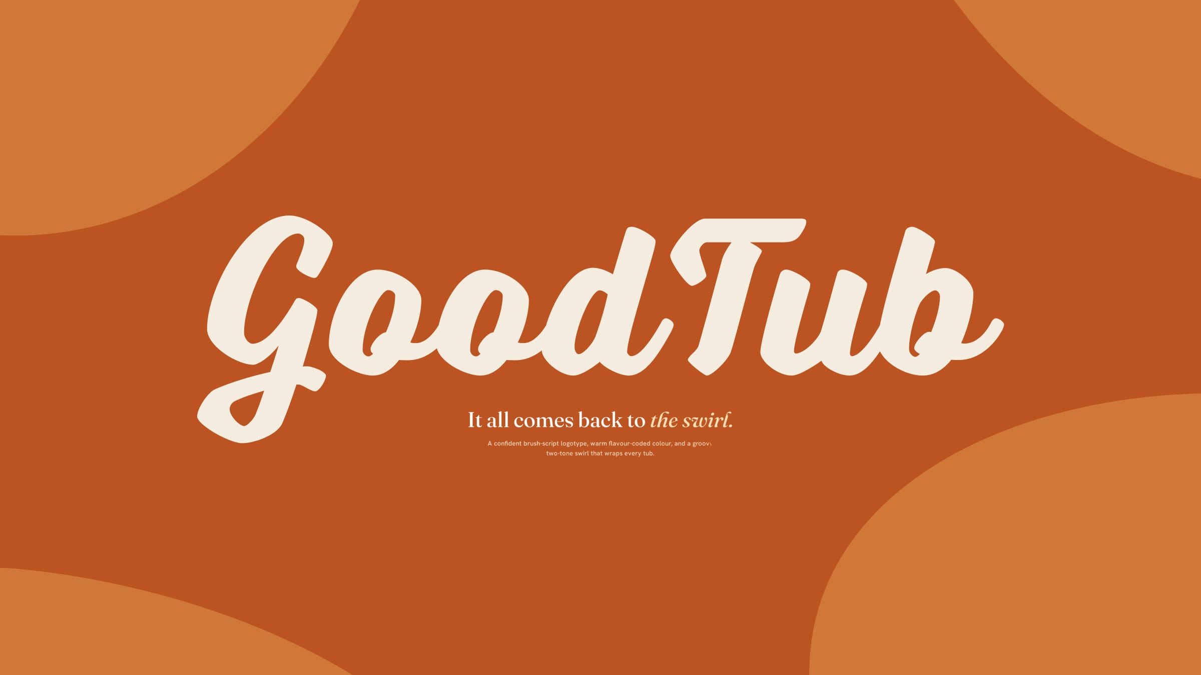
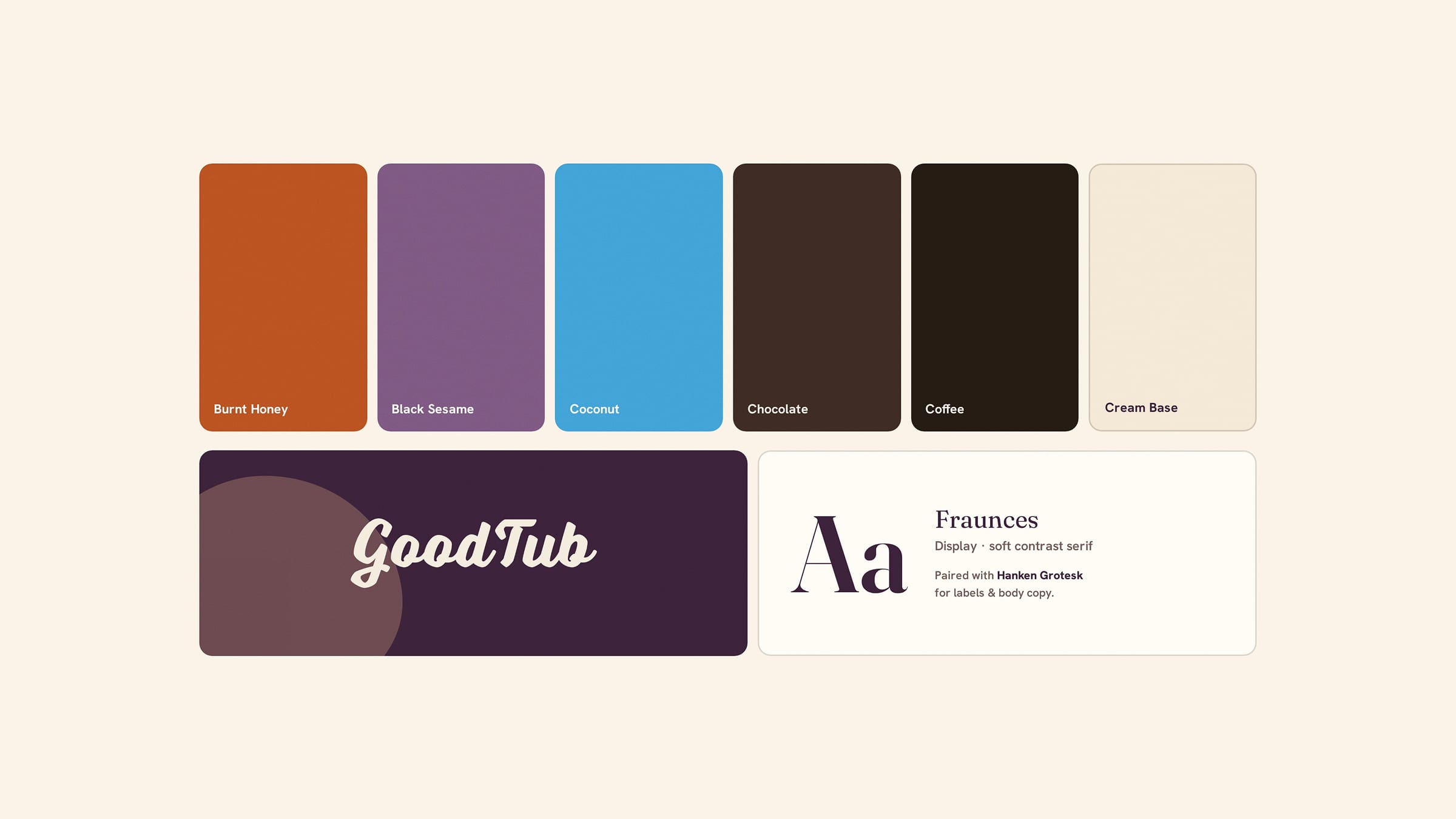
The identity is built on the swirl — a two-tone shape that wraps every tub like the yogurt caught mid-spoon — with a brush-script logotype and a flavour-coded palette giving each tub its own world.
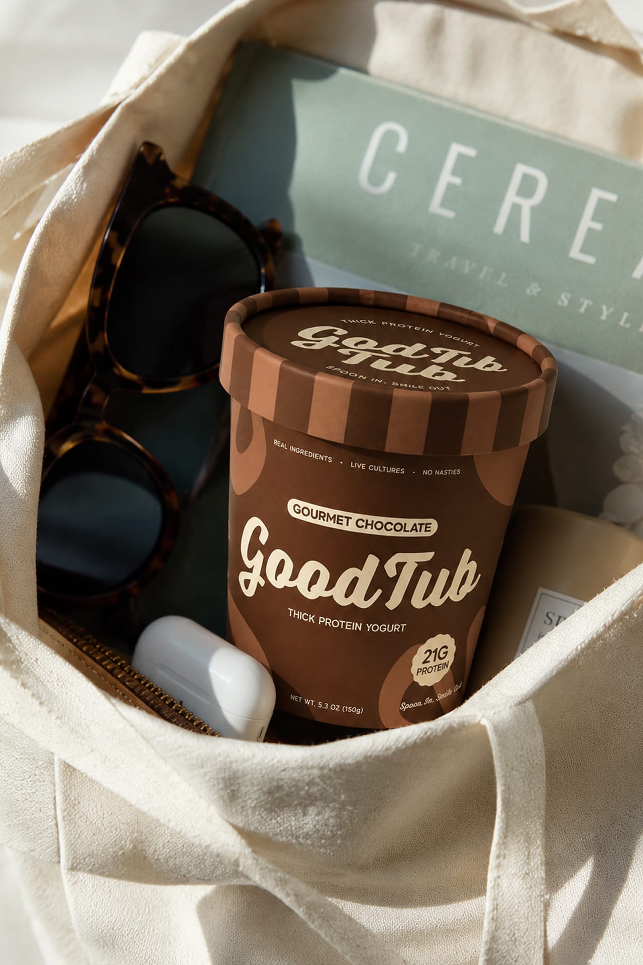
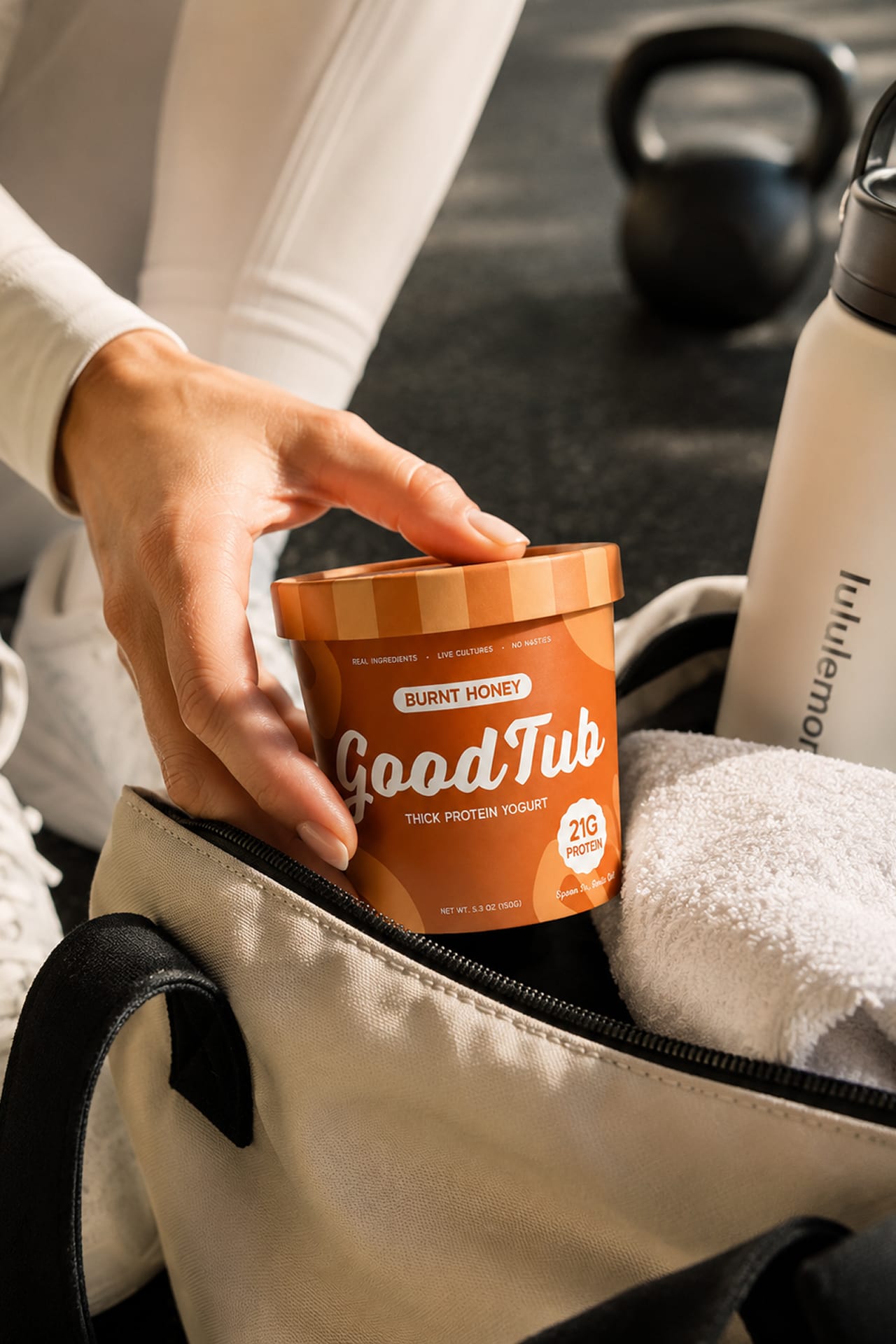
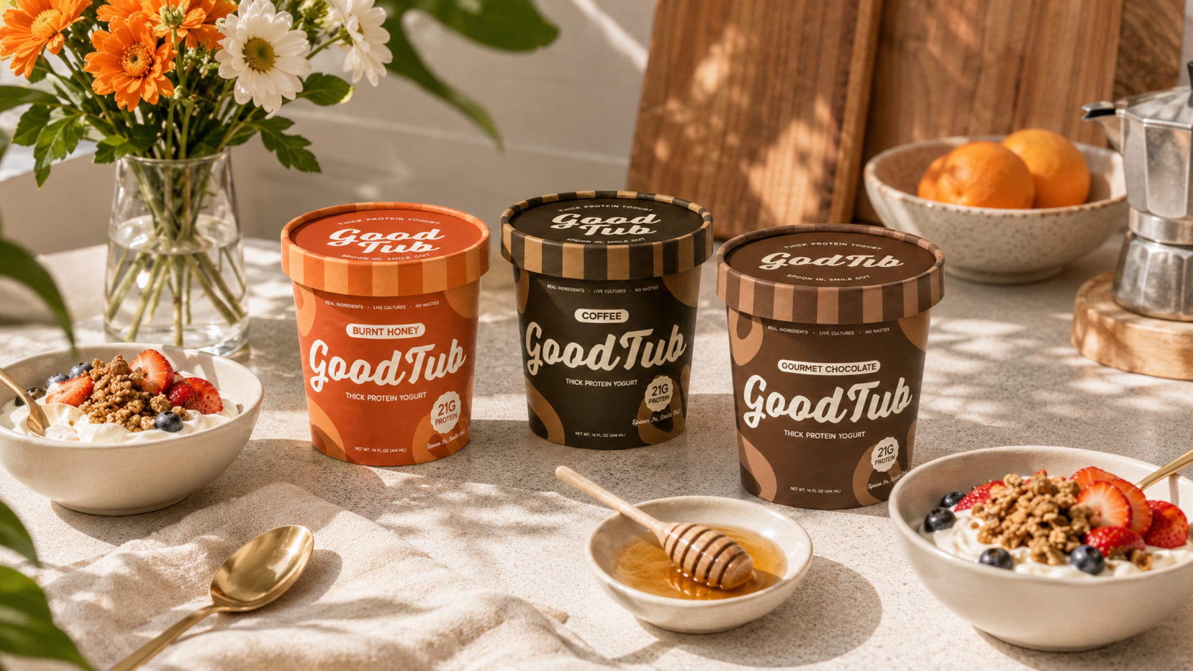
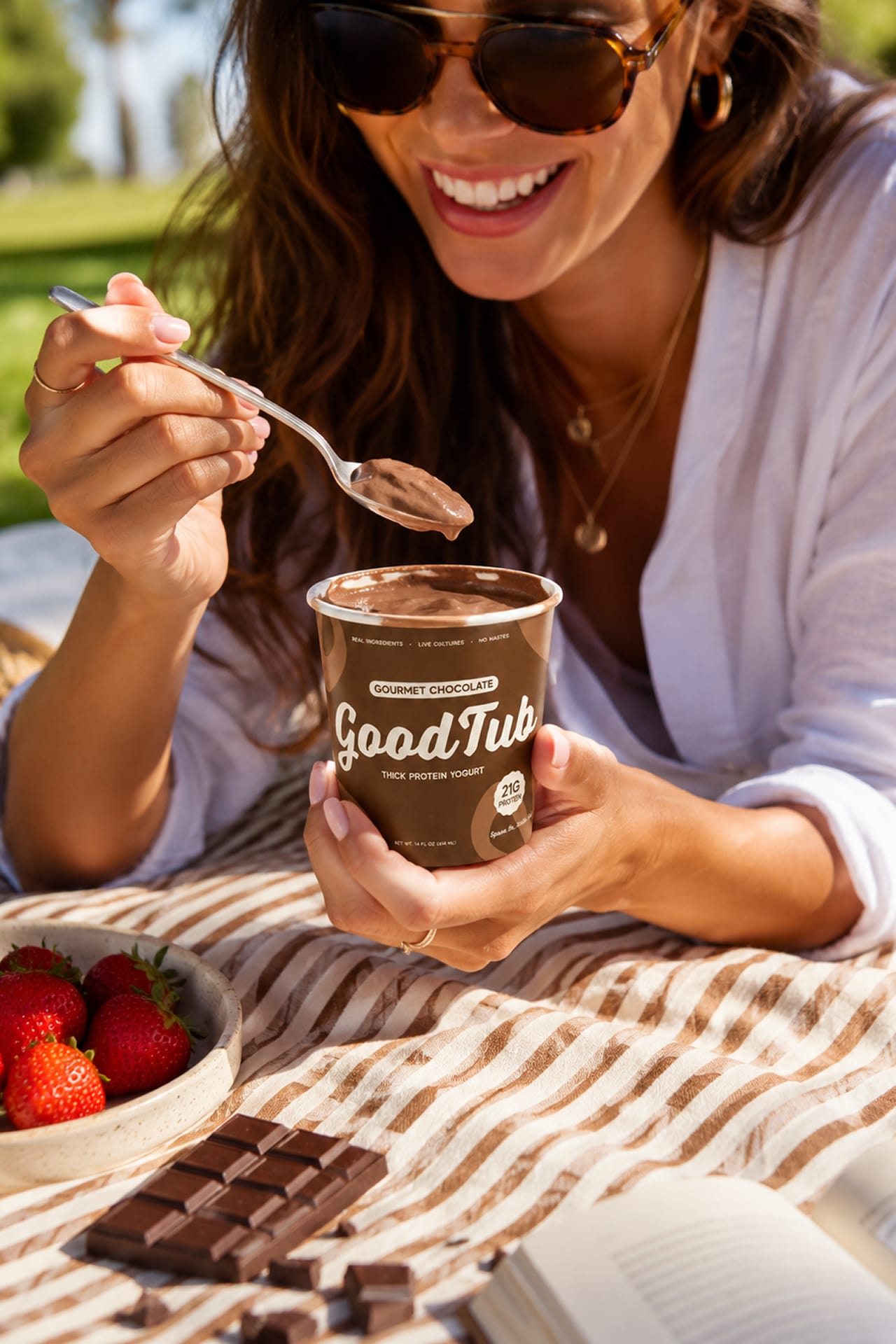
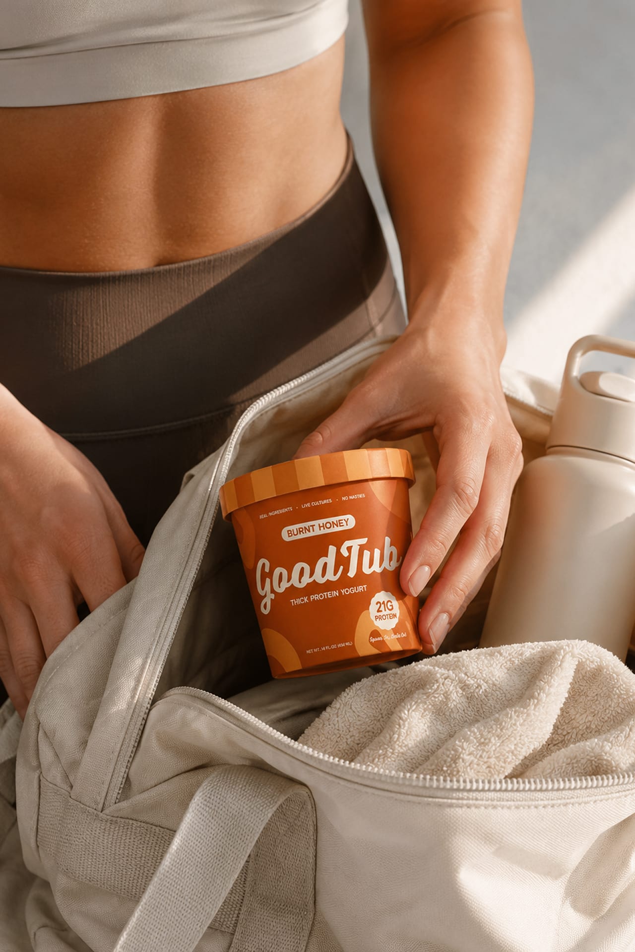
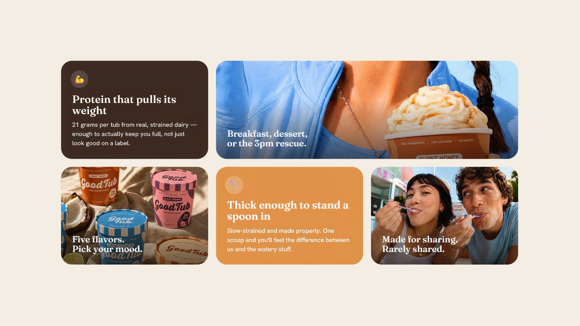
Colour does the heaviest lifting — Burnt Honey in clay orange, Coffee and Chocolate in deep browns, Coconut in sky blue, Black Sesame in plum — so the lineup reads as a spectrum of moods rather than a row of variants. The striped lid and the Spoon In, Smile Out lock-up keep the whole system warm and food-first. The photography splits between appetite-forward studio shots that sell the swirl and candid moments: the gym bag, the picnic, the 3pm rescue.
Next project
Mopsy